Handelsgewinne
Wie groß sind Wohlfahrtsgewinne durch internationalen Handel? Wir leiten eine einfache theoretisch fundierte Formel her, die für viele Modelle diese Handelsgewinne quantifiziert.
Vorlesung
Anwendung
In der heutigen Anwendung berechnen wir die Handelsgewinne für unterschiedliche Länder, visualisieren diese, und korrelieren sie mit einigen möglicherweise relevanten Charakteristika.
Daten laden und vorbereiten
Starten Sie RStudio und legen Sie neues Projekt an. Wie zuvor benötigen wir eine Reihe von Packages:
pacman::p_load(readr)
pacman::p_load(data.table)
pacman::p_load(stringr)
pacman::p_load(ggplot2)
pacman::p_load(lfe)
pacman::p_load(alpaca)
Wir nutzen wieder die zwei gleichen Datensätze der vergangenen Wochen:
- trade_gravity.rds: Bilaterale Handelsdaten und Gravity-Variablen vom CEPII, ursprünglich aus Head, Mayer & Ries (2011)1
- gravity_data.rds: Bilaterale Gravity-Variablen vom CEPII, ursprünglich aus Head & Mayer (2014)2
Laden Sie den ersten Datensatz mittels read_rds():
# Daten laden ####
data = read_rds("input/trade_gravity.rds")
data = data[year >= 1960]
setkey(data, year, iso_o, iso_d)

data_gravity = read_rds("input/gravity_data.rds")
data_gravity = data_gravity[iso3_o == iso3_d, .(country = iso3_o, population = pop_o, area = area_o)]
Wie in der letzten Woche, generieren wir den internen Handel als Differenz aus Produktion und Exporten. Dieses mal sind wir interessiert am Anteil des internen Handels, d.h. wir teilen zusätzlich noch einmal durch das Bruttoinlandsprodukt:
# Interne Handelsflüsse generieren ####
data_trade = data[, .(gdp = unique(gdp_o), exports = sum(value)), by = .(year, country = iso_o)]
data_trade[, interner_handel := (gdp - exports) / gdp]

# Mergen
data = merge(data_trade,
             data_gravity,
             by = "country")
rm(data_trade, data_gravity)
Der “Handelsgewinn”, also der Wohlfahrtsgewinn durch internationalen Handel, berechnet sich einfach mittels der in der Vorlesung erarbeiteten Formel, $\lambda_{jj}^{\frac{1}{1 - \sigma}}$:
# Wohlfahrtsgewinn durch Handel berechnen ####
data[, handelsgewinn := interner_handel^(-1/5.13)]
data[, handelsgewinn := (handelsgewinn - 1) * 100]
Die Top 10 der Länder mit höchstem Handelsgewinn in 2006 sehen dann so aus:
# Top 10 in 2006
data[year == 2006][order(-handelsgewinn)][, .(country = countrycode(country, "iso3c", "country.name"), handelsgewinn)][1:10]
Der Output sollte so aussehen:
              country handelsgewinn
 1: Equatorial Guinea      86.62127
 2:             Libya      46.65776
 3:          Suriname      44.71259
 4:          Slovakia      42.86636
 5:            Guyana      41.24884
 6:       Netherlands      32.66105
 7:  Papua New Guinea      30.52258
 8:          Thailand      30.43467
 9:           Czechia      29.86412
10:           Hungary      29.82568
Wohlfahrtsgewinne visualisieren
Eine einfache Auflistung ist nicht sonder anschaulich, besser geeignet ist eine Weltkarte, in der die Länder je nach Handelsgewinn kolorisiert sind. Dafür installieren und laden wir mehrere neue Pakete:
# Pakete für räumliche Visualisierung
pacman::p_load(sf)
pacman::p_load(rgeos)
pacman::p_load(rnaturalearth)
pacman::p_load(rnaturalearthdata)
Im rnaturalearth Paket ist die sogenannte shapefile für die Länder der Welt. Diese kann man so laden:
# Weltkarte extrahieren
map_world <- ne_countries(scale = "medium", returnclass = "sf")
Wie sehen die Variablen der shapefile aus? Ein sf-Objekt ist im Prinzip ein normaler data.frame (Achtung: Kein data.table!). Der einzige Unterschied ist eine zusätzliche Variable namens geometry:
str(map_world)
Der Output sieht so aus:
Classes ‘sf’ and 'data.frame':	241 obs. of  64 variables:
 $ scalerank : int  3 1 1 1 1 3 3 1 1 1 ...
 $ featurecla: chr  "Admin-0 country" "Admin-0 country" "Admin-0 country" "Admin-0 country" ...
 $ labelrank : num  5 3 3 6 6 6 6 4 2 6 ...
 $ sovereignt: chr  "Netherlands" "Afghanistan" "Angola" "United Kingdom" ...
 $ sov_a3    : chr  "NL1" "AFG" "AGO" "GB1" ...
 $ adm0_dif  : num  1 0 0 1 0 1 0 0 0 0 ...
 ...
 $ iso_a2    : chr  "AW" "AF" "AO" "AI" ...
 $ iso_a3    : chr  "ABW" "AFG" "AGO" "AIA" ...
 $ iso_n3    : chr  "533" "004" "024" "660" ...
 ...
 $ geometry  :sfc_MULTIPOLYGON of length 241; first list element: List of 1
  ..$ :List of 1
  .. ..$ : num [1:10, 1:2] -69.9 -69.9 -69.9 -70 -70.1 ...
  ..- attr(*, "class")= chr [1:3] "XY" "MULTIPOLYGON" "sfg"
 - attr(*, "sf_column")= chr "geometry"
 - attr(*, "agr")= Factor w/ 3 levels "constant","aggregate",..: NA NA NA NA NA NA NA NA NA NA ...
  ..- attr(*, "names")= chr [1:63] "scalerank" "featurecla" "labelrank" "sovereignt" ...
Wir mergen jetzt die Handelsgewinn-Daten an die Karte anhand der iso_a3-Variable, die dasselbe Format wie unsere country-Variable hat:
# Daten von 2006 an Weltkarte mergen
map_data = merge(map_world,
                 data[year == 2006, .(iso_a3 = country, handelsgewinn)],
                 by.x = "iso_a3",
                 all.x = T)
Plotten kann man die Karte ganz einfach mittels des geom_sf():
# Weltweite Handelsgewinne
plot = ggplot() +
  theme_map() +
  geom_sf(data = map_data, aes(fill = handelsgewinn), color = NA)
print(plot)
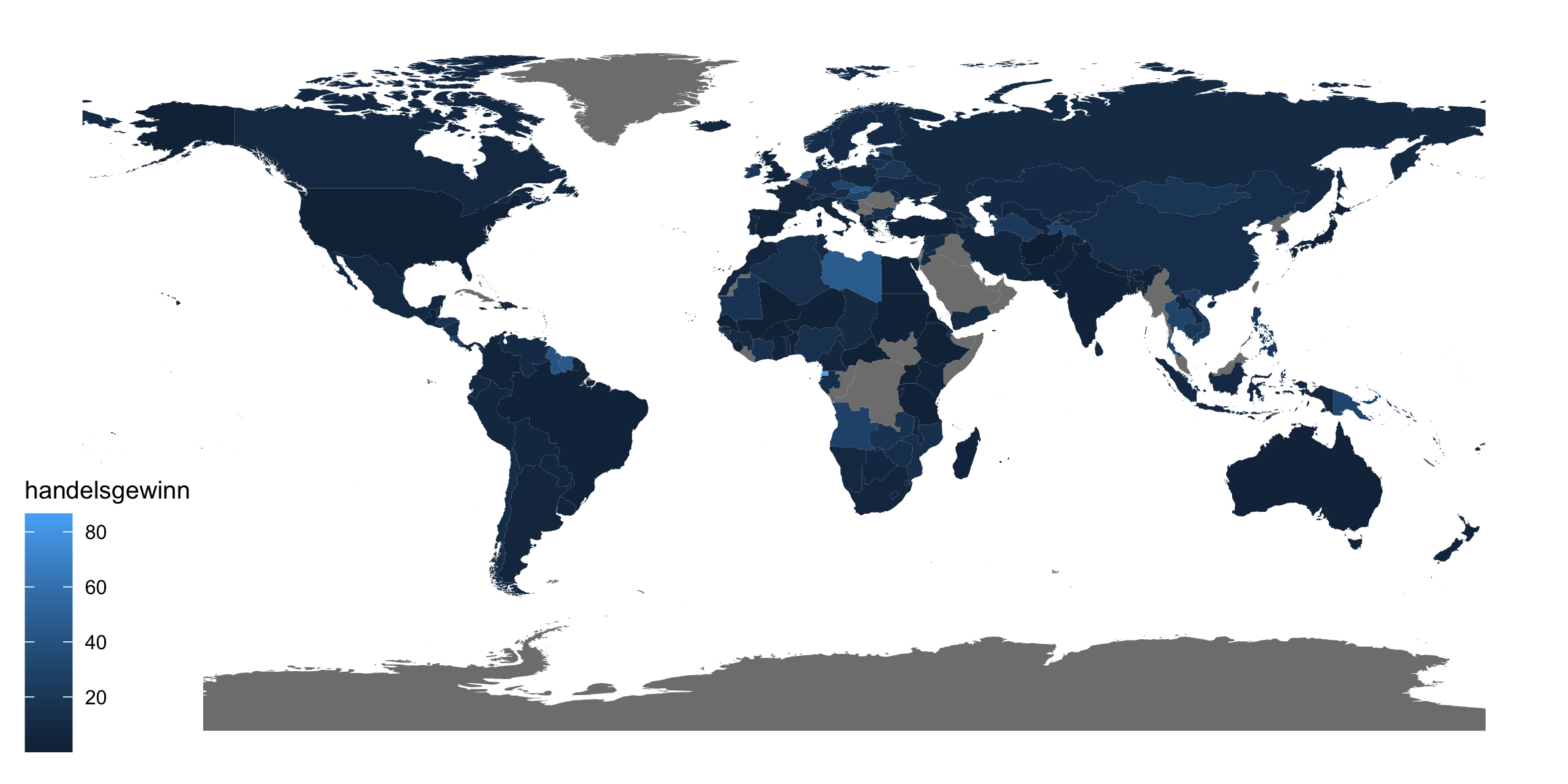
Die Karte sieht zwar nicht schlecht aus, aber gerade die Farben lassen sich noch verbessern. Das viridis Paket hat gute Farbpaletten:
pacman::p_load(viridis)

plot = ggplot() +
  theme_map() +
  geom_sf(data = map_data, aes(fill = handelsgewinn), color = NA) +
  scale_fill_viridis_c(name = "Handelsgewinn in %", option = "plasma",
                       trans = "log", limits = c(0.5, 80),
                       breaks = c(1, 5, 20, 80)) +
  labs(title = "Handelsgewinne in 2006") +
  theme(plot.title = element_text(hjust = 0.5),
        legend.title = element_text(vjust = 0.75),
        legend.position = c(0.05,0.1),
        legend.direction = "horizontal")
print(plot)
ggsave(plot, filename = "output/weltkarte.png", width = 20, height = 10, units = "cm")
rm(plot, coefs)
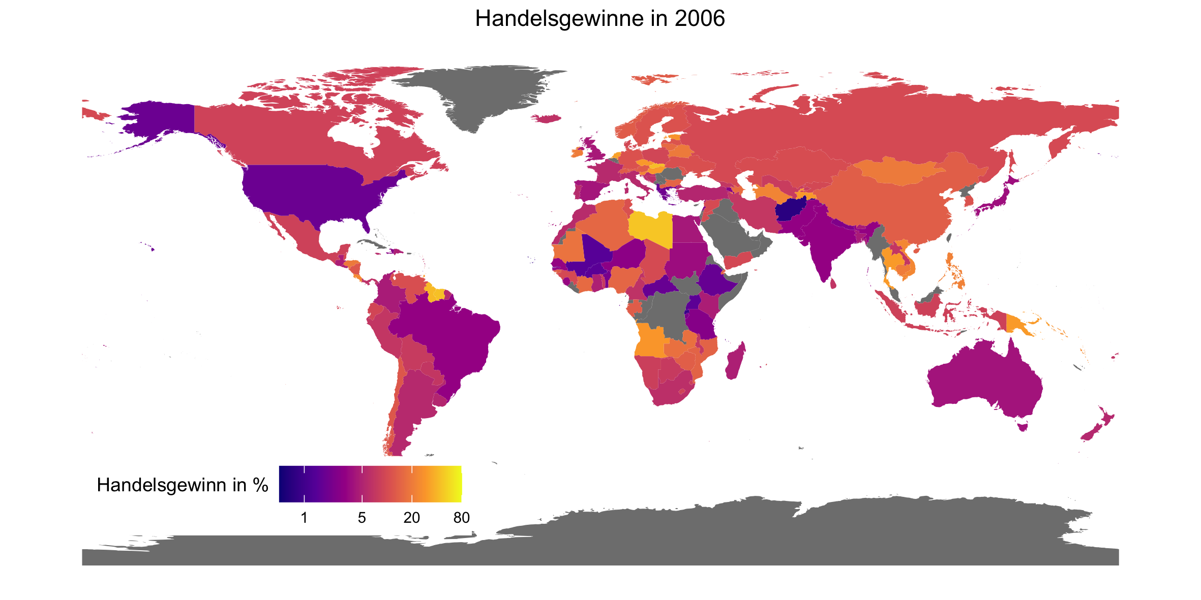
Neben der Farbe habe ich zudem noch die Handelsgewinn log-transformiert, sodass man auch kleinere Werte gut erkennen kann. Mittels coord_sf() kann man “hereinzoomen”, z.B. nach Europa:
# Handelsgewinne in Europa
plot = ggplot() +
  theme_map() +
  geom_sf(data = map_data, aes(fill = handelsgewinn), color = NA) +
  scale_fill_viridis_c(name = "Handelsgewinn in %", option = "plasma",
                       trans = "log", limits = c(0.5, 80),
                       breaks = c(1, 5, 20, 80)) +
  coord_sf(xlim = c(-25, 45), ylim = c(35, 71), expand = FALSE) +
  labs(title = "Handelsgewinne in Europa in 2006") +
  theme(plot.title = element_text(hjust = 0.5),
        legend.title = element_text(vjust = 0.75),
        legend.position = "left",
        legend.justification = "center")
print(plot)
ggsave(plot, filename = "output/europakarte.png", width = 20, height = 10, units = "cm")
rm(plot, coefs, map_data)
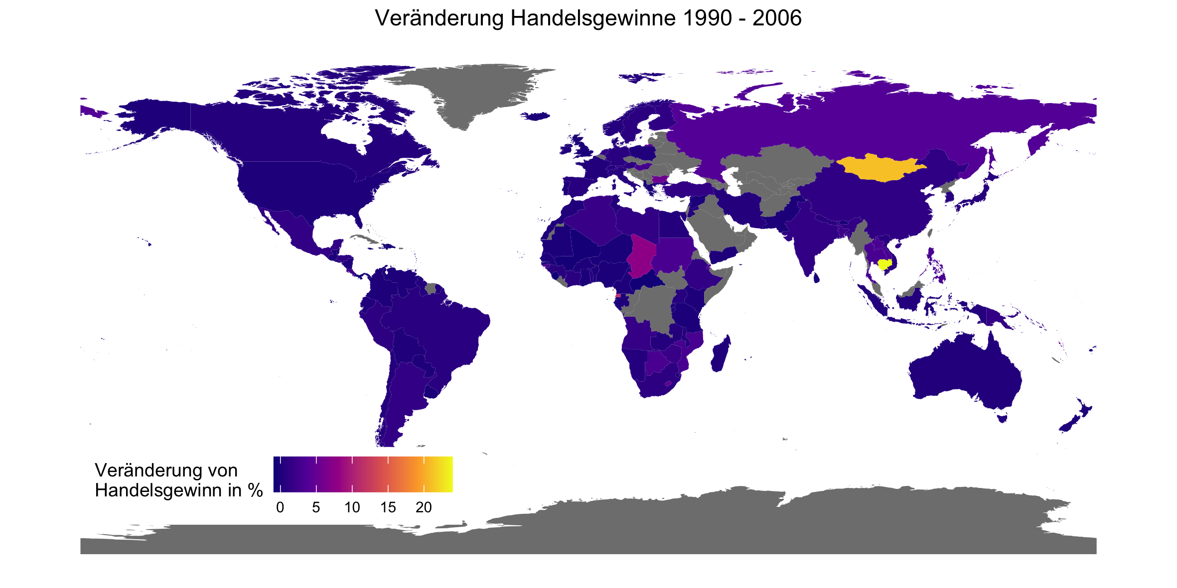
Wohlfahrtsgewinne über die Zeit
Wie haben sich die Handelsgewinne über die Zeit entwickelt? Wir mergen jetzt die Karte noch einmal mit den Handelsgewinn-Daten, allerdings nun auch mit denen von 1990.
# Veränderung Handelsgewinne zwischen 1990 und 2006
map_data = merge(map_world,
                 data[year == 1990, .(iso_a3 = country, handelsgewinn_1990 = handelsgewinn)],
                 by.x = "iso_a3",
                 all.x = T)
map_data = merge(map_data,
                 data[year == 2006, .(iso_a3 = country, handelsgewinn_2006 = handelsgewinn)],
                 by.x = "iso_a3",
                 all.x = T)
Um die Veränderung von 1990 zu 2006 zu plotten, berechnen wir erst diese wie folgt:
map_data$delta_handelsgewinn = (map_data$handelsgewinn_2006 - map_data$handelsgewinn_1990) / map_data$handelsgewinn_1990
Wichtig hier ist, dass das sf-Objekt map_data kein data.table ist, sondern ein “besserer” data.frame. D.h., dass die Syntax für die Operation etwas anders ist. Plotten lässt sich die Veränderung dann ganz einfach:
plot = ggplot() +
  theme_map() +
  geom_sf(data = map_data, aes(fill = delta_handelsgewinn), color = NA) +
  scale_fill_viridis_c(name = "Veränderung von\nHandelsgewinn in %", option = "plasma") +
  labs(title = "Veränderung Handelsgewinne 1990 - 2006") +
  theme(plot.title = element_text(hjust = 0.5),
        legend.title = element_text(vjust = 0.75),
        legend.position = c(0.05,0.1),
        legend.direction = "horizontal")
print(plot)
ggsave(plot, filename = "output/weltkarte_veraenderung.png", width = 20, height = 10, units = "cm")
rm(plot, coefs, map_data, map_world)
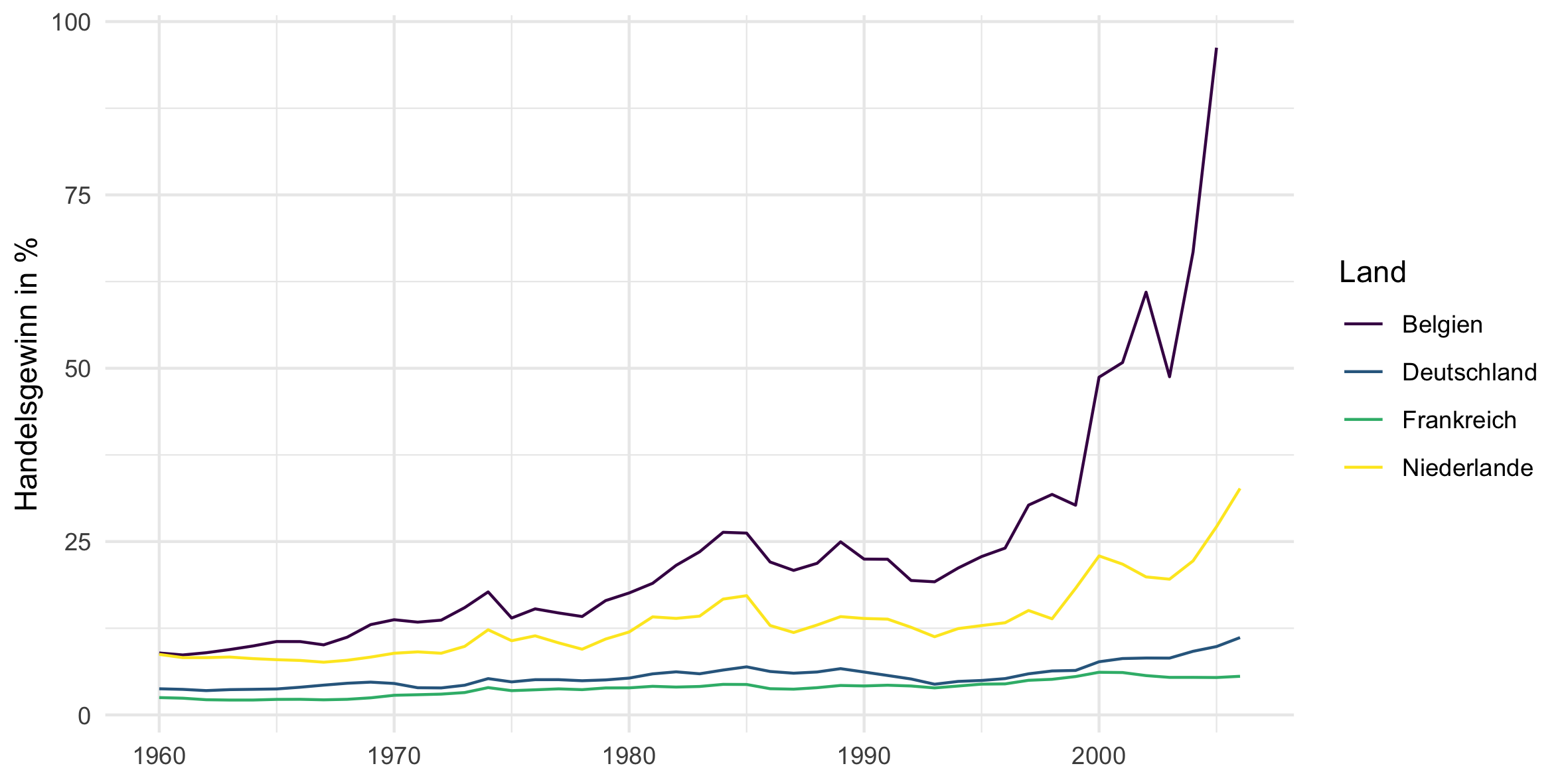
Die Entwicklung der Handelsgewinne einiger weniger Länder über die Zeit lässt sich auch sehr gut mittels geom_line() darstellen. Hier für ein paar europäische Länder:
# Entwicklung der Wohlfahrtsgewinne einzelner Länder
plot_data = data[country %in% c("DEU", "FRA", "NLD", "BEL")]
plot = ggplot(plot_data) +
  theme_minimal() +
  geom_line(aes(x = year, y = handelsgewinn, group = country, color = countrycode(country, "iso3c", "country.name.de"))) +
  scale_color_viridis_d("Land") +
  xlab(NULL) +
  scale_y_continuous("Handelsgewinn in %")
print(plot)
ggsave(plot, filename = "output/europaeische_lander.png", width = 20, height = 10, units = "cm")
rm(plot, plot_data)
… und für ein paar weitere wichtige Staaten:
plot_data = data[country %in% c("USA", "CHN", "GBR", "JPN")]
plot = ggplot(plot_data) +
  theme_minimal() +
  geom_line(aes(x = year, y = handelsgewinn, group = country, color = countrycode(country, "iso3c", "country.name.de"))) +
  scale_color_viridis_d("Land") +
  xlab(NULL) +
  scale_y_continuous("Handelsgewinn in %")
print(plot)
ggsave(plot, filename = "output/wichtige_lander.png", width = 20, height = 10, units = "cm")
rm(plot, plot_data)
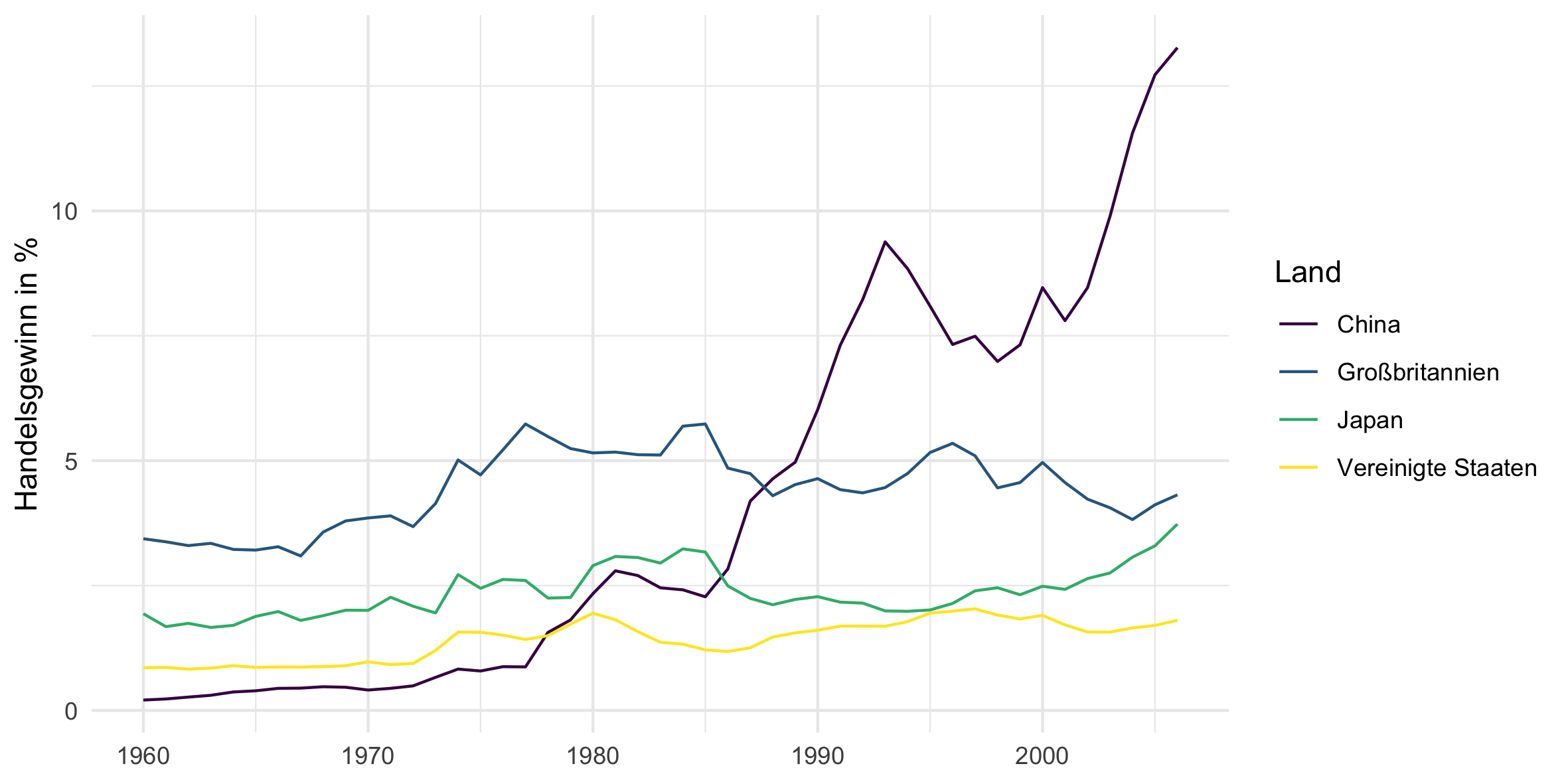
Der Anstieg von Chinas Handelsgewinnen seit ca. 1980 ist gewaltig!
Welche Charakteristika sind mit Handelsgewinnen korreliert?
Was sind Charakteristika, die mit Handelsgewinnen korrelieren? Wir beschrãnken jetzt das Sample auf OECD Mitglieder:
oecd = c("Australia", "Austria", "Belgium", "Canada", "Chile",
         "Colombia", "Czech Republic", "Denmark", "Estonia", "Finland",
         "France", "Germany", "Greece", "Hungary", "Iceland",
         "Ireland", "Israel", "Italy", "Japan", "South Korea",
         "Latvia", "Lithuania", "Luxembourg", "Mexico", "Netherlands",
         "New Zealand", "Norway", "Poland", "Portugal", "Slovakia",
         "Slovenia", "Spain", "Sweden", "Switzerland", "Turkey",
         "United Kingdom", "United States") %>% countrycode("country.name", "iso3c")
Die Fläche des Landes könnte einen Einfluss haben, denn flächenmäßig große Länder haben auch große Distanzen die der interne Handel überwinden muss:
# Fläche
plot_data = data[year == 2006 & country %in% oecd & !is.na(handelsgewinn)]
plot = ggplot(plot_data, aes(x = area, y = handelsgewinn)) +
  theme_minimal() +
  geom_point() +
  geom_smooth(method='lm', formula = y ~ x) +
  geom_text_repel(data = rbind(plot_data[order(- handelsgewinn)][c(1:5)],
                               plot_data[order(- area)][c(1:5)]),
                  aes(label = countrycode(country, "iso3c", "country.name.de"))) +
  scale_x_log10("Fläche in Quadratkilometer", label = scales::comma) +
  scale_y_continuous("Handelsgewinn in %")
print(plot)
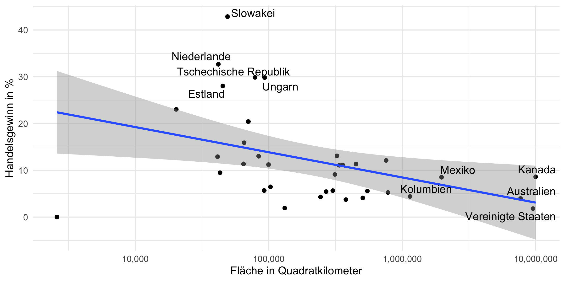
Luxembourg ist ein Outlier, ohne den sieht es so aus:
plot = ggplot(plot_data[country != "LUX"], aes(x = area, y = handelsgewinn)) +
  theme_minimal() +
  geom_point() +
  geom_smooth(method='lm', formula = y ~ x) +
  geom_text_repel(data = rbind(plot_data[order(- handelsgewinn)][c(1:5)],
                               plot_data[order(- area)][c(1:5)]),
                  aes(label = countrycode(country, "iso3c", "country.name.de"))) +
  scale_x_log10("Fläche in Quadratkilometer", label = scales::comma) +
  scale_y_continuous("Handelsgewinn in %")
print(plot)
ggsave(plot, filename = "output/flaeche.png", width = 20, height = 10, units = "cm")
rm(plot)
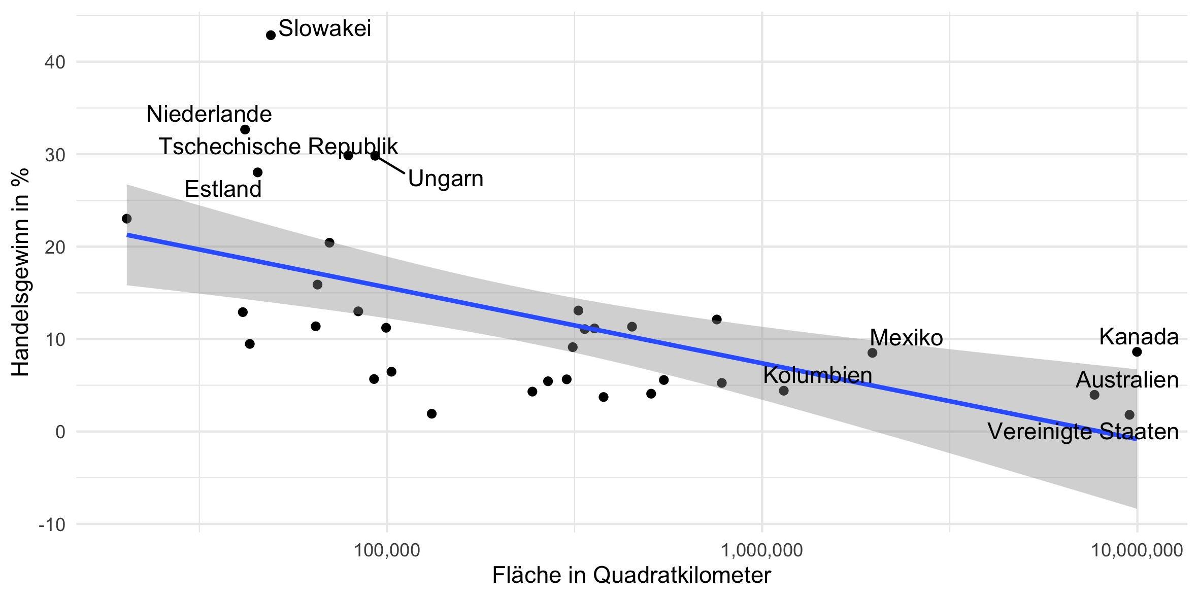
Interessanterweise scheint es hier tendenziell eine negative Korrelation zu geben: Flächenmäßig größere Länder haben ein geringeren Handelsgewinn. Als nächstes plotten wir die Handelsgewinne gegen die Einwohnerzahl: Ein kleines Land hat einen kleineren Markt, d.h. es sollte eigentlich mehr vom Handel gewinnen als ein bevölkerungsreiches Land:
# Einwohner
plot = ggplot(plot_data, aes(x = population, y = handelsgewinn)) +
  theme_minimal() +
  geom_point() +
  geom_smooth(method='lm', formula = y ~ x) +
  geom_text_repel(data = rbind(plot_data[order(- handelsgewinn)][c(1:5)],
                               plot_data[order(- population)][c(1:5)]),
                  aes(label = countrycode(country, "iso3c", "country.name.de"))) +
  scale_x_log10("Fläche in Quadratkilometer", label = scales::comma) +
  scale_y_continuous("Handelsgewinn in %")
print(plot)
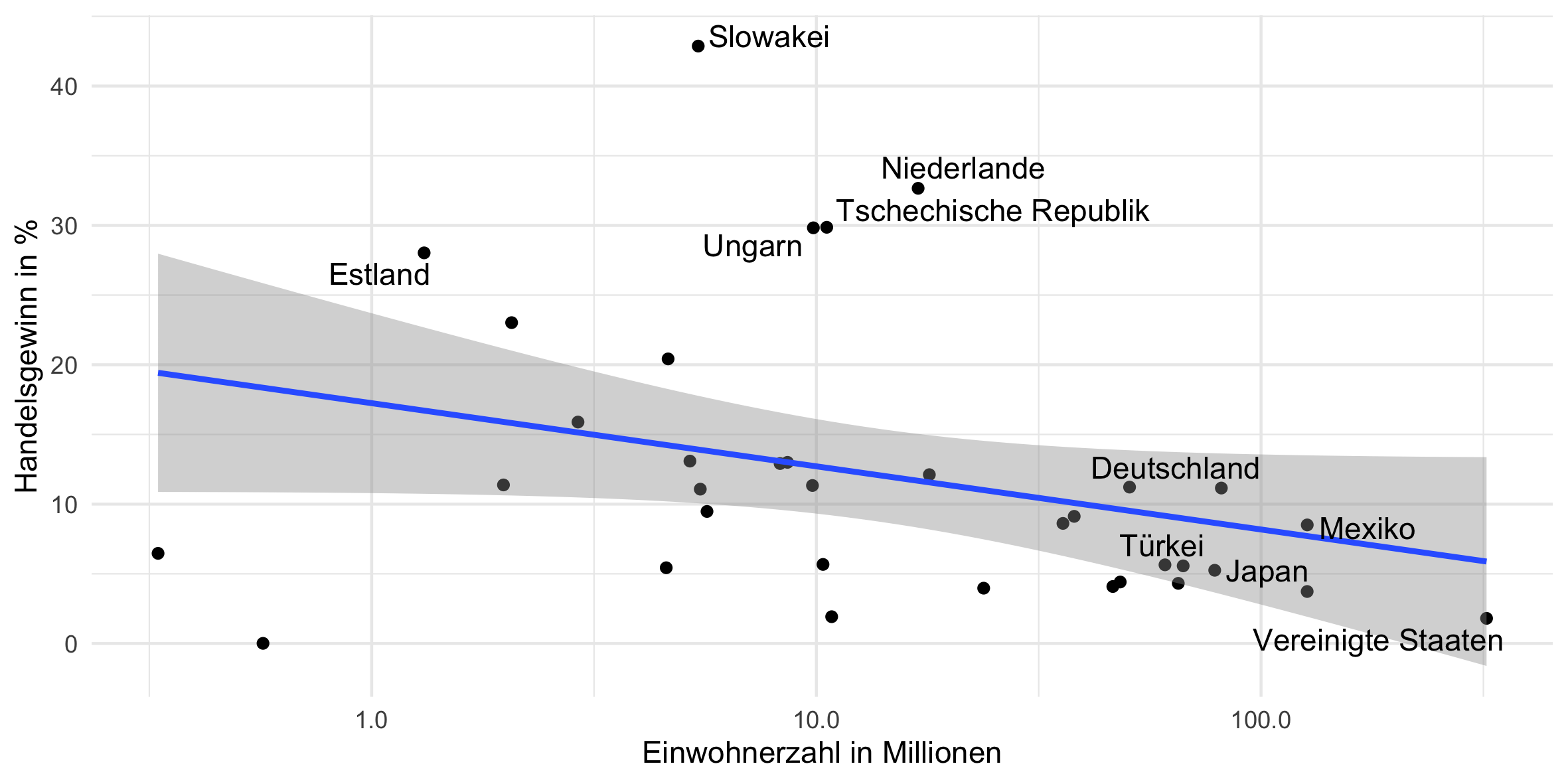
Auch hier ist Luxembourg wieder ein krasser Outlier, ebenso wie Island. Ohne diese beiden Länder sieht der Plot so aus:
plot = ggplot(plot_data[!country %in% c("ISL", "LUX")], aes(x = population, y = handelsgewinn)) +
  theme_minimal() +
  geom_point() +
  geom_smooth(method='lm', formula = y ~ x) +
  geom_text_repel(data = rbind(plot_data[order(- handelsgewinn)][c(1:5)],
                               plot_data[order(- population)][c(1:5)]),
                  aes(label = countrycode(country, "iso3c", "country.name.de"))) +
  scale_x_log10("Fläche in Quadratkilometer", label = scales::comma) +
  scale_y_continuous("Handelsgewinn in %")
print(plot)
ggsave(plot, filename = "output/einwohner.png", width = 20, height = 10, units = "cm")
rm(plot, plot_data)
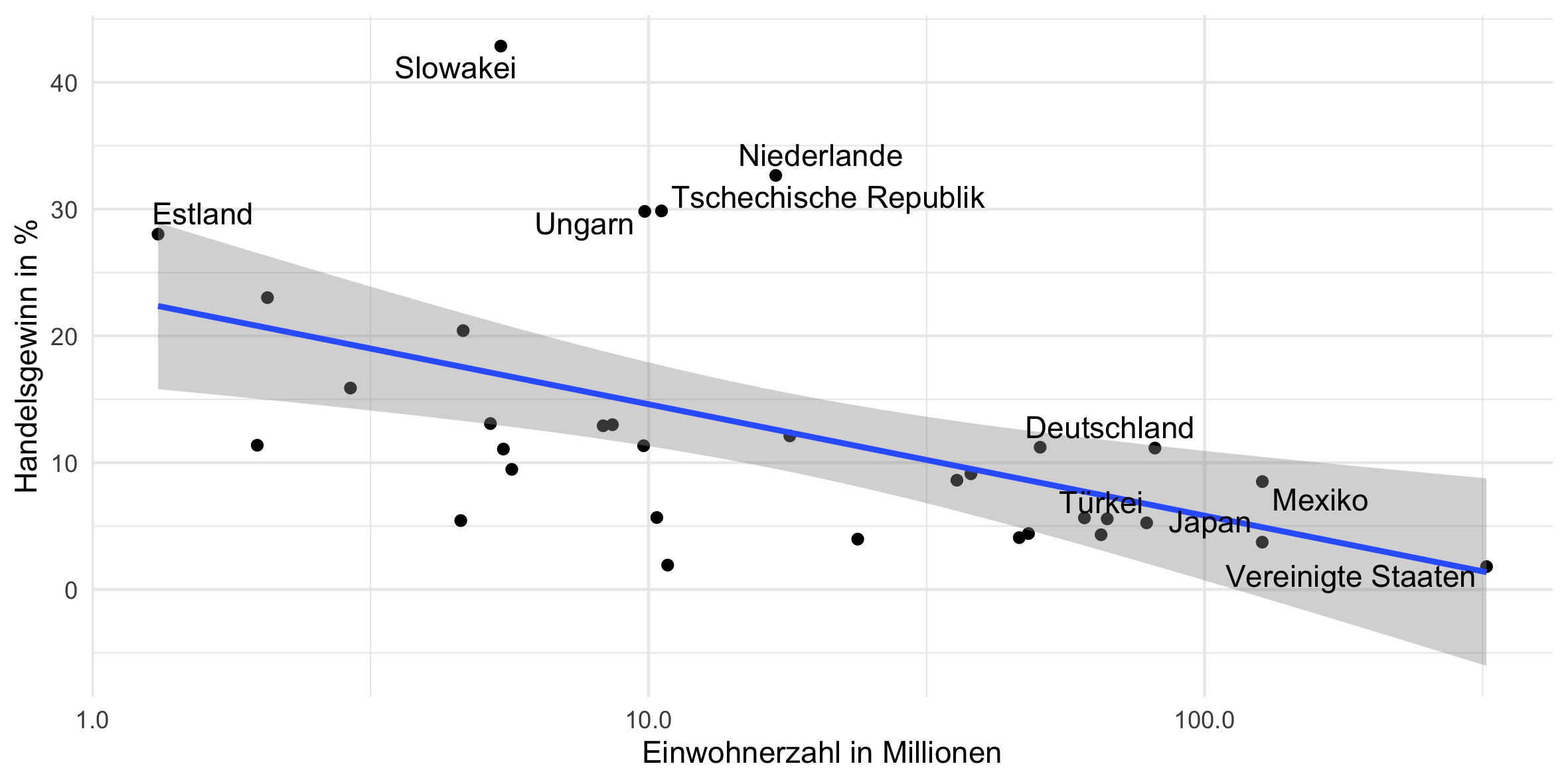
Hier ist, wie erwartet, eine klare negative Korrelation sichtbar. Als letztes schauen wir uns das Pro-Kopf-Einkommen an: Sind die Länder, die einen höheren Handelsgewinn haben auch tendenziell reicher?
# Pro-Kopf Einkommen
plot_data = data[year == 2006 & country %in% oecd & !is.na(handelsgewinn)]
plot = ggplot(plot_data, aes(x = gdp / population, y = handelsgewinn)) +
  theme_minimal() +
  geom_point() +
  geom_smooth(method='lm', formula = y ~ x) +
  geom_text_repel(data = rbind(plot_data[order(- handelsgewinn)][c(1:5)],
                               plot_data[order(- gdp / population)][c(1:5)]),
                  aes(label = countrycode(country, "iso3c", "country.name.de"))) +
  scale_x_log10("Pro-Kopf Einkommen in US-Dollar", label = scales::dollar) +
  scale_y_continuous("Handelsgewinn in %")
print(plot)
ggsave(plot, filename = "output/prokopfeinkommen.png", width = 20, height = 10, units = "cm")
rm(plot, plot_data)
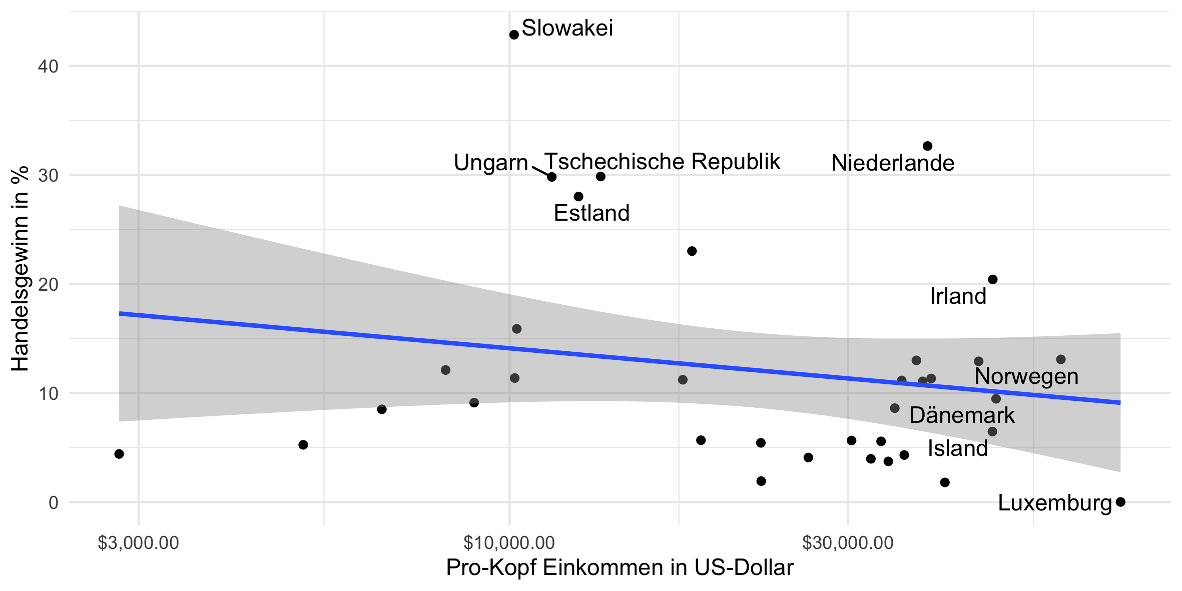
Das scheint nicht grundsätzlich der Fall zu sein, die Korrelation ist nahe 0.
Head, K., Mayer, T. & Ries, J. (2010), “The erosion of colonial trade linkages after independence”. Journal of International Economics, 81(1):1-14 ↩︎
Head, K. and T. Mayer, (2014), “Gravity Equations: Toolkit, Cookbook, Workhorse.” Handbook of International Economics, Vol. 4.eds. Gopinath, Helpman, and Rogoff, Elsevier. ↩︎